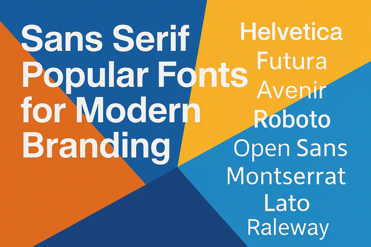
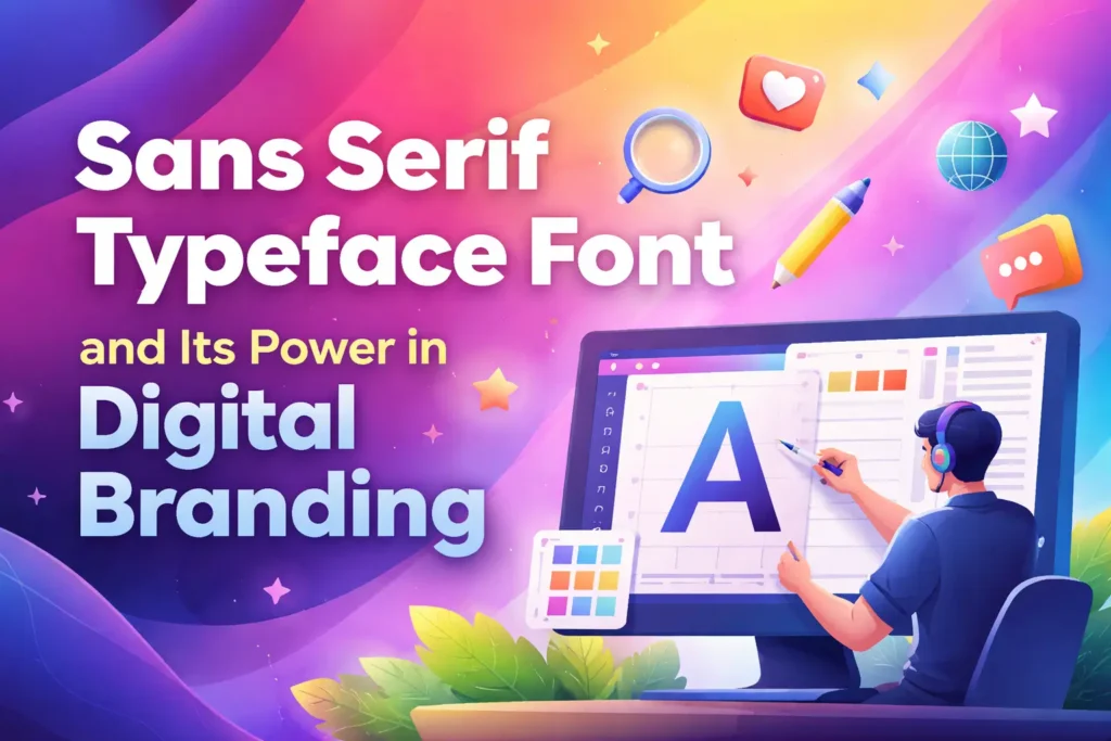
Sans serif popular fonts. Have you ever noticed how Helvetica or Roboto seem to appear in almost every logo or app interface you use daily? That familiarity is no accident. These sans serif popular fonts have become the visual backbone of modern design. Their simplicity, balance, and clarity make them ideal for both print and digital use.
In this article, we will uncover why sans serif fonts have stood the test of time, explore the most iconic examples, and see how they shape the aesthetics of today’s branding, websites, and user experiences.
Why Sans Serif Fonts Are So Widely Used
1. Simplicity with Purpose
Sans serif fonts are called that because they lack the decorative strokes known as serifs. This absence creates a clean, minimalist appearance that feels modern and professional. It allows your message to stand out without visual clutter.
2. Readability and Accessibility
These fonts are engineered for clarity. Their uniform stroke widths make text easy to read on screens, mobile devices, and print. According to a report by Adobe, designers prefer sans serif fonts for digital interfaces due to their superior legibility in varying resolutions.
3. Emotional Impact and Versatility
Sans serif fonts communicate honesty, innovation, and confidence. Brands like Google, Spotify, and Airbnb use them because they convey a friendly yet forward-thinking tone that resonates globally.
| Font Characteristic | Impact on Perception |
|---|---|
| Clean Lines | Feels modern and professional |
| Consistent Spacing | Enhances legibility |
| Minimal Ornamentation | Projects clarity and honesty |
| Geometric Balance | Adds sophistication and precision |
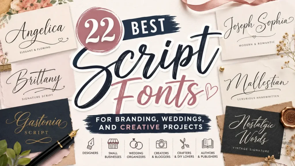
Read More : Best Fonts for Tattoo Names with Stunning Style
Classic and Timeless Sans Serif Fonts
Helvetica
Often regarded as the king of sans serif fonts, Helvetica is clean, balanced, and infinitely adaptable. It’s the font of choice for global brands like BMW, Panasonic, and Lufthansa because it communicates neutrality and professionalism.
Futura
A geometric classic that exudes sleekness and modernity. Futura’s precise lines and forward-looking style make it ideal for tech brands and high-end packaging.
Avenir
Avenir bridges elegance and modernism. Its soft geometric structure makes it perfect for both corporate identity and digital design projects. It feels human yet futuristic at the same time.
Popular Digital and Web Sans Serif Fonts
Roboto
Designed by Google, Roboto was made for digital readability. Its clean curves and open forms make it the default choice for Android systems and mobile apps around the world.
Open Sans
A humanist sans serif that’s optimized for screens. It is one of the most downloaded fonts on Google Fonts because it looks great at every size. Perfect for blogs, websites, and e-learning platforms.
Montserrat
Inspired by old Buenos Aires signage, Montserrat has a strong geometric form and is frequently used for web headings and brand visuals.
Lato
Lato offers a warm, approachable tone without losing its professional edge. It’s widely used in corporate branding, mobile apps, and presentations.
Poppins
This geometric sans serif is known for its circular shapes and wide range of weights. Tech and fintech startups often choose Poppins for its clarity and flexible design.
Inter
Inter was created for user interfaces and digital products. Its open letterforms and tall x-height make it perfect for small text displays.
Source Sans Pro
Adobe’s first open-source font offers neutrality and warmth. It’s a reliable choice for technology companies and professional services that require a consistent visual tone.
Other Notable Sans Serif Popular Fonts
Gencha Font
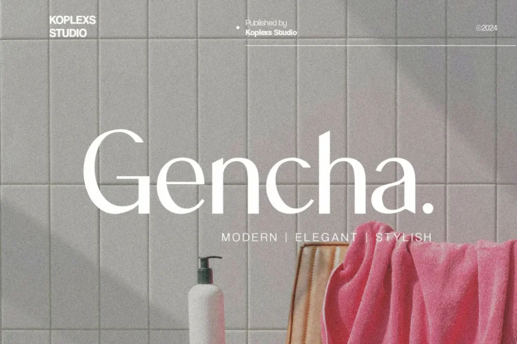
Gencha Font combines bold geometry with soft rounded edges, making it ideal for brands that want to look modern yet approachable. Its balanced letterforms bring a professional aesthetic that works perfectly for posters, tech startups, and lifestyle products.
Hipo Font
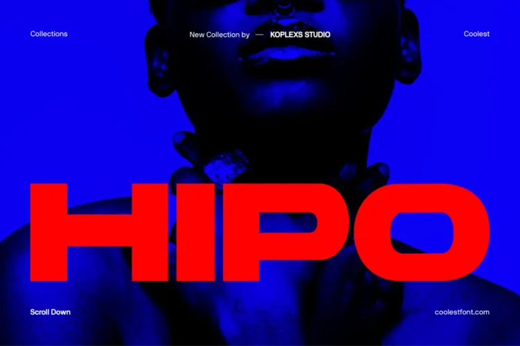
Hipo Font offers a clean, minimalist appearance that blends futuristic design with human warmth. It performs beautifully in editorial layouts and digital branding where readability and style are equally important.
Barytons Font
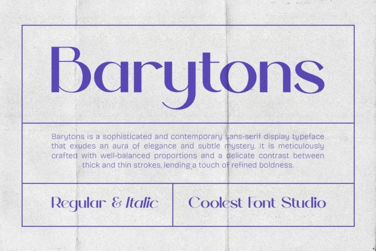
Barytons Font is a sleek sans serif that balances elegance and strength. Its sharp cuts and consistent proportions make it suitable for professional presentations, business cards, and product packaging that require a confident identity.
Cofigra Font
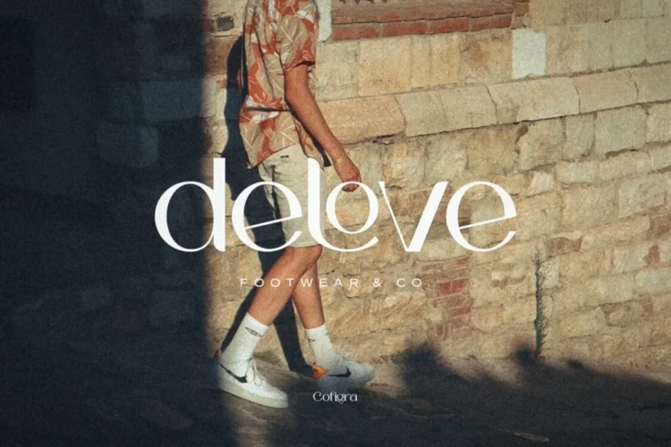
Cofigra Font brings a modern, creative personality to any project. With a slightly condensed structure and stylish curves, it’s a favorite among designers creating fashion branding, app interfaces, or high-end logos.
Saloums Font
Saloums Font stands out with its soft geometric form and timeless simplicity. It’s a great choice for lifestyle blogs, travel websites, and minimalist branding projects that need a friendly and relaxed feel.
Wrecks Font
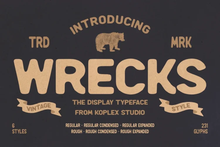
Wrecks Font is a contemporary sans serif with strong character. It balances boldness and clarity, making it perfect for attention-grabbing headlines, posters, or modern editorial designs that want a fresh visual edge.
Bourne Font
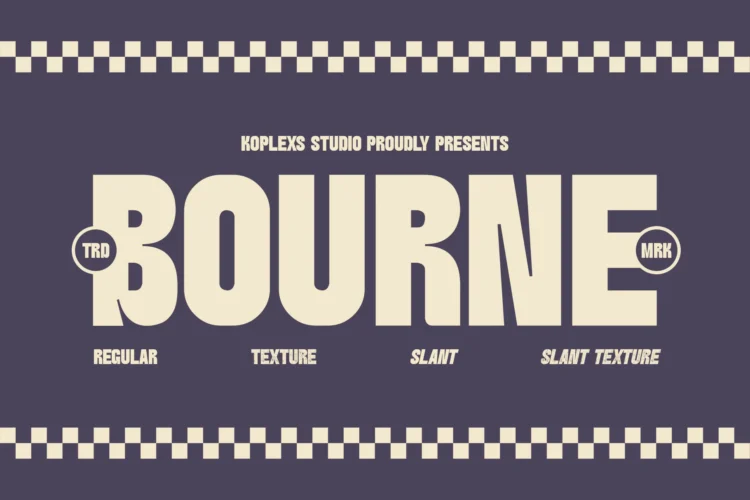
Bourne Font embodies modern sophistication. Its clean strokes and versatile weight options make it a great tool for brand identities, advertising materials, and elegant website typography.
Backfarm Font

Backfarm Font features a minimalist and geometric construction that exudes confidence and order. It’s ideal for designers seeking a font that fits modern architecture firms, technology brands, or innovative digital platforms.
How to Choose the Right Sans Serif Font
Selecting the best sans serif font depends on your design goal and audience perception. Here’s a quick guide:
- For corporate identity: Helvetica, Lato, or Avenir.
- For digital interfaces: Roboto, Inter, or Open Sans.
- For modern branding: Montserrat, Poppins, or Proxima Nova.
- For luxury appeal: Raleway or Futura.
Tip: Always test font readability at different screen sizes. Even the most beautiful font can fail if it’s not legible in real-world conditions.
Expert Insights and Real-World Examples
According to a Forbes report on visual branding trends, companies that use consistent typography across channels see a 23% increase in brand recognition. This highlights how crucial font choice is for brand identity.
For instance:
- Spotify relies on a custom sans serif typeface to convey its creative energy.
- Google’s Material Design standardizes Roboto for UI uniformity.
- Netflix commissioned its own sans serif font, Netflix Sans, to improve scalability and save licensing costs.
These examples underline the importance of both aesthetic and functional consistency in digital design.
Conclusion
Sans serif fonts represent the perfect blend of form and function. From Helvetica’s timeless charm to Roboto’s digital precision, these typefaces shape how we perceive brands, read content, and interact with technology.
If you want your design to feel modern, approachable, and professional, choosing the right sans serif popular font is an excellent first step.
Ready to elevate your visual identity? Start exploring these fonts today and find the one that speaks your brand’s language.
FAQ About Sans Serif Popular Fonts
What is the main difference between serif and sans serif fonts?
Serif fonts have decorative strokes at the ends of letters, while sans serif fonts do not. Sans serif fonts appear cleaner and are easier to read on screens.
Which sans serif font is best for websites?
Roboto and Open Sans are among the best choices for websites because they are optimized for screen readability and load quickly.
Are sans serif fonts better for logos?
Yes, many brands choose sans serif fonts for logos because they look modern, bold, and timeless across different media.
What is the most popular sans serif font?
Helvetica remains the most widely recognized and used sans serif font globally, followed closely by Roboto and Open Sans.
Can I mix sans serif fonts together?
Yes, but use caution. Pairing a geometric sans serif like Futura with a humanist one like Lato can create a balanced visual hierarchy.


Leave a Comment